


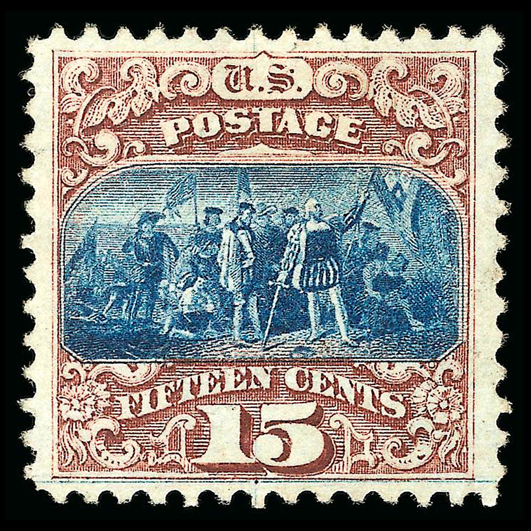

United States stamp Scott #118 is part of the 1869 Pictorial Issue, a series that departed from the earlier practice of exclusively featuring portraits of political leaders and instead included historical events, allegorical themes, and transportation imagery. Scott #118 represents the 15-cent denomination of the series and depicts the landing of Christopher Columbus.
Issued in 1869, it was designed to meet international and higher-value postal rates, making it a key component of the set for transatlantic correspondence. The stamp is recognized as Type I, which refers to specific plate and impression characteristics that distinguish it from later reissues and varieties.
Within the series, it holds significance as one of the first U.S. stamps to feature a historical scene rather than a portrait, aligning with the broader intent of the 1869 issue to diversify stamp subjects.
Design & Print
Scott #118 was printed by the National Bank Note Company under the federal contract during the tenure of Postmaster General Alexander Randall. The stamp was issued in 1869, and approximately 1,406,500 examples were produced.
The design portrays the 1492 landing of Columbus, adapted from a painting by John Vanderlyn. The vignette is printed in blue, while the frame and surrounding elements are in brown, marking it as one of the early bicolor issues in U.S. postage history.
The denomination “15” appears in numerals in the lower corners, with “FIFTEEN CENTS” inscribed clearly along the bottom. The stamp was produced on hard wove paper and impressed with the G grill, a feature designed to prevent the reuse of stamps by allowing cancellation ink to penetrate the fibers. Its bicolor design and historical subject matter set it apart from the simpler, single-color designs of previous series.
Scott #118 (Type I) can easily be confused with Scott #119 (Type II). They are nearly the same exact identical designs. The Scott Catalogue mentions horizontal vs diagonal shading lines on the sign of the vignette. However these can often be difficult to see as the vignette is often shifted during the printing process, covering up the shading lines.
Luckily there is a much easier way to tell them apart. Continue reading to learn how.
Postal Usage
The 15-cent denomination of Scott #118 was primarily used to cover foreign letter rates, particularly the rate for letters sent to the United Kingdom and other European destinations.
At the time, the standard rate for a half-ounce letter to Britain via contracted steamship service was 12 cents, with other combinations of weight and destination requiring additional postage. The 15-cent stamp allowed for flexible use in such cases, either as a single franking for specific treaty arrangements or in combination with other denominations for more complex rates.
Domestically, the 15-cent stamp could be used on larger parcels or multiple-weight letters, though its primary function was in facilitating international mail. The 1860s were a period of evolving postal treaties between the United States and foreign governments, and higher-value denominations like Scott #118 reflected the need for stamps that corresponded directly to those arrangements.
Identification
Scott #118 can be identified by its brown frame surrounding a blue vignette depicting the landing of Columbus. The stamp is perforated 12, printed on hard wove paper, and bears the G grill, generally measuring 9–13 points by 11–13 points.
The easiest way to tell the difference between #118 and #119 is to look just under the word “POSTAGE”. On Scott #118 this area is empty, somewhat in the shape of teepee. On Scott #119 there is a diamond shape in the same place.
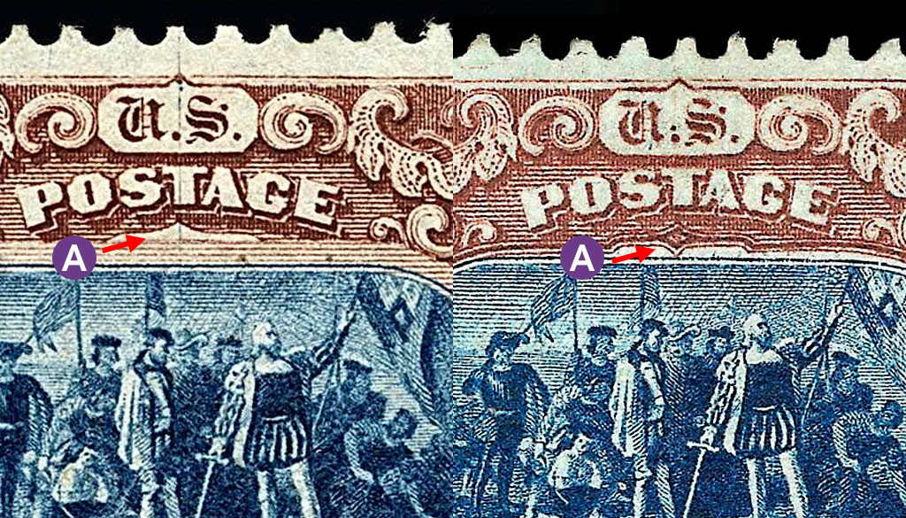
A. Scott #118 has an empty space under “POSTAGE”, whereas on Scott #119 there is a diamond shape in the same place.
The denomination “15” in oval frames and the inscription “U.S. POSTAGE” along the top are consistent with the design standards of the 1869 series. Proper identification requires attention to the integrity of the vignette details, the color balance between the blue and brown inks, and the presence of the grill impression.
Its distinct bicolor format and subject matter prevent confusion with other denominations in the same series, though careful study is necessary to separate it from later printings and reissues.


Ask A Question Or Leave A Comment